Manually describing UI components to Claude Code for every new feature is like writing CSS without classes, repetitive, inconsistent, and impossible to scale across teams. Claude Code Skills for building UI turn your design system into executable tools that generate components, layouts, and styles with predictable parameters and zero boilerplate.
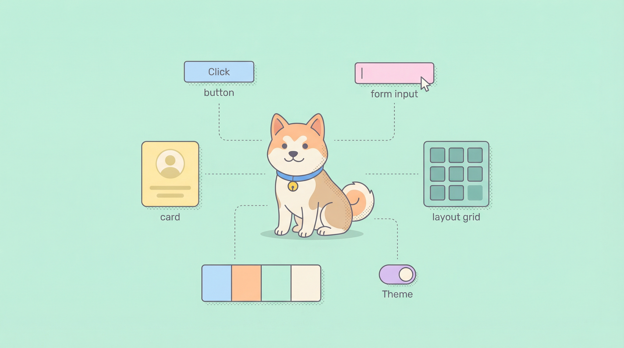
What Are Claude Code Skills for Building UI?
Claude Code Skills package UI generation logic into reusable, versioned tools that Claude Code can discover and invoke via the Model Context Protocol (MCP). Instead of crafting verbose prompts like “Create a responsive card component with Tailwind, a left-aligned image, right-aligned text, and a primary button,” you define a building-ui skill once and call it with concise parameters: component: "card", layout: "image-left".
Each skill consists of a SKILL.md file that defines:
- Tool name and description: What the skill does and when Claude should use it
- Parameter schema: Type-safe inputs with validation
- Examples: Concrete usage patterns for training Claude
- Implementation: The actual handler that generates code
The building-ui skill from the official repository provides patterns for components, layouts, themes, and forms. It transforms ad-hoc UI generation into a systematic, repeatable process.
Key Advantages Over Raw Prompting
- Consistency: Same component structure every time
- Type safety: Claude validates parameters before generation
- Version control: Skills live in Git, trackable and reviewable
- Team sharing: One skill serves an entire engineering organization
- Performance: No need to re-explain design tokens or spacing scales
Want an integrated, All-in-One platform for your Developer Team to work together with maximum productivity?
Apidog delivers all your demands, and replaces Postman at a much more affordable price!
Setting Up the building-ui Skill
Step 1: Install Claude Code and Enable MCP
If you haven’t installed Claude Code CLI:
npm install -g @anthropic-ai/claude-code
claude --version  # Should be >= 2.0.70
Create the MCP configuration directory and file:
# macOS/Linux
mkdir -p ~/.config/claude-code
touch ~/.config/claude-code/config.json

# Windows
mkdir %APPDATA%\claude-code
echo {} > %APPDATA%\claude-code\config.json
Step 2: Clone and Build the building-ui Skill
git clone https://github.com/anthropics/skills.git
cd skills/skills/building-ui
npm install
npm run build
This compiles the TypeScript handlers to dist/index.js.
Step 3: Configure MCP to Load the Skill
Edit ~/.config/claude-code/config.json:
{
  "mcpServers": {
    "building-ui": {
      "command": "node",
      "args": ["/absolute/path/to/skills/building-ui/dist/index.js"],
      "env": {
        "UI_LIBRARY": "react",
        "STYLE_SYSTEM": "tailwind",
        "THEME_CONFIG": "~/project/design-tokens.json"
      }
    }
  }
}
Critical:
- Use absolute paths for
args. Relative paths fail when Claude spawns the process - Set environment variables to configure the skill globally:
UI_LIBRARY:react,vue,svelteSTYLE_SYSTEM:tailwind,styled-components,css-modulesTHEME_CONFIG: Path to your design token file
Step 4: Verify Installation
claude
Once loaded, run:
/list-tools
You should see:
Available tools:
- building-ui:generate-component
- building-ui:create-layout
- building-ui:apply-theme
- building-ui:generate-form
If tools don’t appear, check logs:
# macOS/Linux
tail -f ~/.cache/claude-code/logs/mcp.log

# Windows
type %APPDATA%\claude-code\logs\mcp.log
Common issues:
- ENOENT: Wrong path to
dist/index.js - Missing env vars: Skill fails to load theme config
- Version mismatch: Claude Code version doesn’t support MCP features
Core Building UI Patterns with Skills
The building-ui skill exports four primary tools. Each accepts structured parameters and returns generated code.
1. Generate Component Tool
Tool name: building-ui:generate-component
Use case: Create reusable UI components
Parameters:
component: Component name (button, card, modal, input, select)variants: Array of style variants (primary, secondary, outline)size: small | medium | largecustomProps: Record of additional propertieschildren: Boolean (whether component accepts children)
Example: Create a button with variants
Use the generate-component tool to create a button component with variants primary, secondary, and outline, size medium, and support for disabled state.
Generated output (React + Tailwind):
// Button.tsx
import React from 'react';
import clsx from 'clsx';

interface ButtonProps extends React.ButtonHTMLAttributes<HTMLButtonElement> {
  variant?: 'primary' | 'secondary' | 'outline';
  size?: 'small' | 'medium' | 'large';
}

export const Button: React.FC<ButtonProps> = ({
  variant = 'primary',
  size = 'medium',
  disabled,
  children,
  className,
  ...props
}) => {
  const baseClasses = 'font-semibold rounded-lg transition-colors';
  const variantClasses = {
    primary: 'bg-blue-600 text-white hover:bg-blue-700',
    secondary: 'bg-gray-200 text-gray-900 hover:bg-gray-300',
    outline: 'border-2 border-blue-600 text-blue-600 hover:bg-blue-50'
  };
  const sizeClasses = {
    small: 'px-3 py-1.5 text-sm',
    medium: 'px-4 py-2 text-base',
    large: 'px-6 py-3 text-lg'
  };

  return (
    <button
      disabled={disabled}
      className={clsx(
        baseClasses,
        variantClasses[variant],
        sizeClasses[size],
        disabled && 'opacity-50 cursor-not-allowed',
        className
      )}
      {...props}
    >
      {children}
    </button>
  );
};
The skill infers TypeScript types, accessibility attributes, and styling classes based on your environment variables.
2. Create Layout Tool
Tool name: building-ui:create-layout
Use case: Generate responsive page layouts
Parameters:
type: grid | flex | stack | sidebarcolumns: Number of columns (for grid)gap: Spacing scale (0, 1, 2, 3, 4, 5, 6, 8, 10, 12)responsive: Object with breakpoint configsareas: Named grid areas (e.g., "header header", "sidebar main")
Example: Dashboard layout with responsive sidebar
Use create-layout to generate a responsive dashboard layout with a collapsible sidebar, header, main content area, and footer. Use gap-4 and make the sidebar 256px wide on desktop, full width on mobile.
Generated output:
// DashboardLayout.tsx
import React, { useState } from 'react';
import clsx from 'clsx';

interface DashboardLayoutProps {
  header?: React.ReactNode;
  sidebar?: React.ReactNode;
  main: React.ReactNode;
  footer?: React.ReactNode;
}

export const DashboardLayout: React.FC<DashboardLayoutProps> = ({
  header,
  sidebar,
  main,
  footer
}) => {
  const [sidebarOpen, setSidebarOpen] = useState(false);

  return (
    <div className="min-h-screen flex flex-col">
      {/* Header */}
      <header className="bg-white shadow-sm border-b border-gray-200 z-10">
        <div className="px-4 sm:px-6 lg:px-8 py-4">
          {header}
        </div>
      </header>

      <div className="flex flex-1">
        {/* Mobile menu button */}
        <button
          className="lg:hidden fixed bottom-4 right-4 bg-blue-600 text-white p-3 rounded-full shadow-lg z-20"
          onClick={() => setSidebarOpen(!sidebarOpen)}
        >
          ☰
        </button>

        {/* Sidebar */}
        <aside className={clsx(
          'bg-gray-50 border-r border-gray-200',
          'fixed lg:relative inset-y-0 left-0 z-30',
          'w-64 transform transition-transform lg:translate-x-0',
          sidebarOpen ? 'translate-x-0' : '-translate-x-full lg:translate-x-0'
        )}>
          <div className="p-4">
            {sidebar}
          </div>
        </aside>

        {/* Main content */}
        <main className="flex-1 p-4 sm:p-6 lg:p-8">
          {main}
        </main>
      </div>

      {/* Footer */}
      {footer && (
        <footer className="bg-gray-50 border-t border-gray-200 mt-auto">
          <div className="px-4 sm:px-6 lg:px-8 py-4">
            {footer}
          </div>
        </footer>
      )}
    </div>
  );
};
The skill automatically adds mobile menu logic, breakpoint-aware classes, and accessible attributes.
3. Apply Theme Tool
Tool name: building-ui:apply-theme
Use case: Enforce design tokens across components
Parameters:
component: Target component namecolorScheme: light | dark | systemspacingScale: 0-12 (Tailwind spacing scale)typography: Object with font sizes, weights, familiescustomTokens: Record of CSS custom properties
Example: Apply dark theme to a card component
Use apply-theme to configure a Card component for dark mode with slate color palette, spacing scale 4, and Inter font family.
Generated output:
// card-theme.ts
export const cardTheme = {
  light: {
    background: 'bg-white',
    border: 'border-gray-200',
    text: 'text-gray-900',
    subText: 'text-gray-600'
  },
  dark: {
    background: 'bg-slate-800',
    border: 'border-slate-700',
    text: 'text-slate-100',
    subText: 'text-slate-400'
  }
};

// Usage in Card.tsx
import { cardTheme } from './card-theme';

interface CardProps {
  variant?: 'light' | 'dark';
  children: React.ReactNode;
}

export const Card: React.FC<CardProps> = ({ variant = 'light', children }) => {
  const theme = cardTheme[variant];

  return (
    <div className={clsx(
      'rounded-lg p-4 border',
      theme.background,
      theme.border
    )}>
      {children}
    </div>
  );
};
The skill reads your THEME_CONFIG file and generates theme-specific token maps. If THEME_CONFIG points to a JSON file:
{
  "colors": {
    "primary": "#3B82F6",
    "secondary": "#6B7280"
  },
  "fonts": {
    "sans": "Inter",
    "mono": "JetBrains Mono"
  }
}
The generated code uses these exact values instead of Tailwind defaults.
4. Generate Form Tool
Tool name: building-ui:generate-form
Use case: Create validated forms from schemas
Parameters:
fields: Array of field definitions (name, type, label, validation)submitAction: Function name or API endpointvalidationMode: onBlur | onChange | onSubmitlayout: vertical | horizontal | grid
Example: User registration form with validation
Use generate-form to create a user registration form with fields: name (text, required), email (email, required), password (password, min length 8), and acceptTerms (checkbox). Submit to /api/register with onBlur validation.
Generated output:
// UserRegistrationForm.tsx
import React, { useState } from 'react';
import { z } from 'zod';
import { zodResolver } from '@hookform/resolvers/zod';
import { useForm, SubmitHandler } from 'react-hook-form';

const schema = z.object({
  name: z.string().min(1, 'Name is required'),
  email: z.string().email('Invalid email address'),
  password: z.string().min(8, 'Password must be at least 8 characters'),
  acceptTerms: z.boolean().refine(val => val === true, {
    message: 'You must accept the terms'
  })
});

type FormData = z.infer<typeof schema>;

export const UserRegistrationForm: React.FC = () => {
  const [isSubmitting, setIsSubmitting] = useState(false);

  const {
    register,
    handleSubmit,
    formState: { errors },
    trigger
  } = useForm<FormData>({
    resolver: zodResolver(schema),
    mode: 'onBlur'
  });

  const onSubmit: SubmitHandler<FormData> = async (data) => {
    setIsSubmitting(true);
    try {
      const response = await fetch('/api/register', {
        method: 'POST',
        headers: { 'Content-Type': 'application/json' },
        body: JSON.stringify(data)
      });

      if (!response.ok) throw new Error('Registration failed');

      // Handle success
      console.log('User registered:', await response.json());
    } catch (error) {
      console.error('Registration error:', error);
    } finally {
      setIsSubmitting(false);
    }
  };

  return (
    <form onSubmit={handleSubmit(onSubmit)} className="space-y-4 max-w-md">
      <div>
        <label htmlFor="name" className="block text-sm font-medium text-gray-700">
          Name
        </label>
        <input
          id="name"
          {...register('name')}
          className={clsx(
            'mt-1 block w-full rounded-md border-gray-300 shadow-sm focus:border-blue-500 focus:ring-blue-500',
            errors.name && 'border-red-500'
          )}
        />
        {errors.name && (
          <p className="mt-1 text-sm text-red-600">{errors.name.message}</p>
        )}
      </div>

      <div>
        <label htmlFor="email" className="block text-sm font-medium text-gray-700">
          Email
        </label>
        <input
          id="email"
          type="email"
          {...register('email')}
          className={clsx(
            'mt-1 block w-full rounded-md border-gray-300 shadow-sm focus:border-blue-500 focus:ring-blue-500',
            errors.email && 'border-red-500'
          )}
        />
        {errors.email && (
          <p className="mt-1 text-sm text-red-600">{errors.email.message}</p>
        )}
      </div>

      <div>
        <label htmlFor="password" className="block text-sm font-medium text-gray-700">
          Password
        </label>
        <input
          id="password"
          type="password"
          {...register('password')}
          className={clsx(
            'mt-1 block w-full rounded-md border-gray-300 shadow-sm focus:border-blue-500 focus:ring-blue-500',
            errors.password && 'border-red-500'
          )}
        />
        {errors.password && (
          <p className="mt-1 text-sm text-red-600">{errors.password.message}</p>
        )}
      </div>

      <div className="flex items-center">
        <input
          id="acceptTerms"
          type="checkbox"
          {...register('acceptTerms')}
          className="h-4 w-4 text-blue-600 border-gray-300 rounded focus:ring-blue-500"
        />
        <label htmlFor="acceptTerms" className="ml-2 block text-sm text-gray-900">
          I accept the terms and conditions
        </label>
      </div>
      {errors.acceptTerms && (
        <p className="text-sm text-red-600">{errors.acceptTerms.message}</p>
      )}

      <button
        type="submit"
        disabled={isSubmitting}
        className="w-full flex justify-center py-2 px-4 border border-transparent rounded-md shadow-sm text-sm font-medium text-white bg-blue-600 hover:bg-blue-700 focus:outline-none focus:ring-2 focus:ring-offset-2 focus:ring-blue-500 disabled:opacity-50"
      >
        {isSubmitting ? 'Registering...' : 'Register'}
      </button>
    </form>
  );
};
The skill automatically wires up react-hook-form, zod validation, accessibility attributes, and loading states.
Dynamic UI Generation using Advanced Techniques
Conditional Rendering Logic
Some UIs need conditional sections based on parameters. The skill supports conditions in field definitions:
Generate a user profile form where the "company" field only appears if "accountType" is "business".
This produces a form with conditional rendering:
{accountType === 'business' && (
  <div>
    <label htmlFor="company">Company</label>
    <input id="company" {...register('company')} />
  </div>
)}
Component Composition
Build complex UIs by chaining skill calls:
First, generate a DashboardLayout component with sidebar and header. Then, generate a StatCard component for metrics. Finally, apply dark theme to both.
Claude Code executes these sequentially, passing context between calls. The layout component is available when generating the card, ensuring proper integration.
Theme Switching at Runtime
Configure the skill to emit theme-aware code:
{
  "building-ui": {
    "command": "node",
    "args": ["dist/index.js"],
    "env": {
      "UI_LIBRARY": "react",
      "STYLE_SYSTEM": "tailwind",
      "THEME_CONFIG": "~/project/themes.json",
      "SUPPORT_THEME_TOGGLE": "true"
    }
  }
}
Now generated components include a ThemeProvider wrapper:
// App.tsx
import { ThemeProvider } from './ThemeProvider';
import { DashboardLayout } from './DashboardLayout';

function App() {
  return (
    <ThemeProvider defaultTheme="light" enableSystem>
      <DashboardLayout />
    </ThemeProvider>
  );
}
Debugging and Iterating Building UI Skills
View Generated Code in .claude-cache
Claude Code caches skill outputs. Inspect them:
# macOS/Linux
cat ~/.cache/claude-code/last-skill-output.tsx

# Windows
type %APPDATA%\claude-code\last-skill-output.tsx
If the generated code doesn’t match expectations, refine your parameters. Add more specificity:
Instead of: "Generate a card"
Use: "Generate a card with 16px padding, 8px border radius, and a subtle box shadow"
Override Skill Defaults Per Project
Create .claude-ui-config.json in your project root:
{
  "uiLibrary": "vue",
  "styleSystem": "css-modules",
  "themeConfig": "./design-tokens.json"
}
This overrides global MCP settings for that project only.
Versioning Skills
When you update the building-ui skill, tag versions:
cd skills/building-ui
npm version patch  # Or minor/major
git tag -a v1.1.0 -m "Added support for Vue 3.5"
Update Claude Code config to pin versions:
{
  "mcpServers": {
    "building-ui": {
      "command": "node",
      "args": ["/path/to/skills/building-ui-v1.1.0/dist/index.js"]
    }
  }
}
This prevents breaking changes from affecting production workflows.
Conclusion
Claude Code Skills for building UI convert natural language into production-ready components, layouts, themes, and forms with surgical precision. By investing 15 minutes in setup, you gain a reusable toolkit that enforces design consistency, eliminates boilerplate, and accelerates feature development. Start with the four core tools—generate-component, create-layout, apply-theme, and generate-form—then extend them for your specific design system.
When your skills generate API-consuming UIs, validate those endpoints with Apidog to ensure your AI-built interfaces talk to reliable backends.