การอธิบายส่วนประกอบ UI ด้วยตนเองให้ Claude Code สำหรับฟีเจอร์ใหม่แต่ละอย่างนั้น เหมือนกับการเขียน CSS โดยไม่มีคลาส ซึ่งซ้ำซาก ไม่สอดคล้องกัน และไม่สามารถปรับขนาดได้ในทีม Claude Code Skills สำหรับการสร้าง UI จะเปลี่ยนระบบการออกแบบของคุณให้เป็นเครื่องมือที่เรียกใช้งานได้ ซึ่งสร้างส่วนประกอบ โครงร่าง และสไตล์ด้วยพารามิเตอร์ที่คาดเดาได้และไม่มีโค้ดที่ไม่จำเป็น (boilerplate)
Claude Code Skills สำหรับการสร้าง UI คืออะไร?
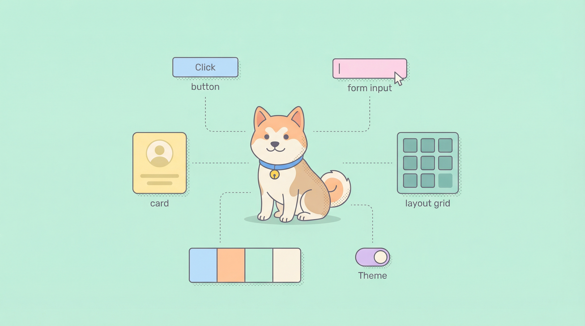
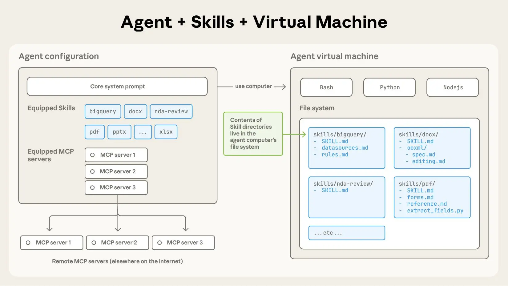
Claude Code Skills บรรจุตรรกะการสร้าง UI ไว้ในเครื่องมือที่นำมาใช้ซ้ำได้และมีการกำหนดเวอร์ชัน ซึ่ง Claude Code สามารถค้นพบและเรียกใช้ผ่าน Model Context Protocol (MCP) แทนที่จะต้องสร้างพรอมต์ที่ยาวเหยียด เช่น "สร้างคอมโพเนนต์การ์ดที่ตอบสนอง (responsive) ด้วย Tailwind, รูปภาพจัดชิดซ้าย, ข้อความจัดชิดขวา และปุ่มหลัก" คุณสามารถกำหนด Skill ชื่อ building-ui เพียงครั้งเดียวและเรียกใช้ด้วยพารามิเตอร์ที่กระชับ: component: "card", layout: "image-left"
แต่ละ Skill ประกอบด้วยไฟล์ SKILL.md ที่กำหนดสิ่งต่อไปนี้:
- ชื่อเครื่องมือและคำอธิบาย: Skill ทำอะไรและเมื่อใดที่ Claude ควรใช้มัน
- Schema พารามิเตอร์: อินพุตที่ปลอดภัยทางประเภทพร้อมการตรวจสอบความถูกต้อง
- ตัวอย่าง: รูปแบบการใช้งานที่เป็นรูปธรรมสำหรับการฝึก Claude
- การนำไปใช้งาน: ตัวจัดการจริงที่สร้างโค้ด
Skill building-ui จาก repository อย่างเป็นทางการมีรูปแบบสำหรับส่วนประกอบ, โครงร่าง, ธีม และฟอร์ม มันเปลี่ยนการสร้าง UI แบบเฉพาะกิจให้เป็นกระบวนการที่เป็นระบบและทำซ้ำได้
ข้อดีหลักเมื่อเทียบกับการใช้พรอมต์ดิบ
- ความสอดคล้อง: โครงสร้างส่วนประกอบเหมือนกันทุกครั้ง
- ความปลอดภัยของประเภท: Claude ตรวจสอบพารามิเตอร์ก่อนการสร้าง
- การควบคุมเวอร์ชัน: Skills อยู่ใน Git สามารถติดตามและตรวจสอบได้
- การแบ่งปันในทีม: Skill หนึ่งสามารถให้บริการองค์กรวิศวกรรมทั้งหมด
- ประสิทธิภาพ: ไม่จำเป็นต้องอธิบาย design token หรือ spacing scale ซ้ำอีก
ต้องการแพลตฟอร์มแบบ All-in-One แบบครบวงจรสำหรับทีมพัฒนาของคุณ เพื่อทำงานร่วมกันด้วย ประสิทธิภาพสูงสุด หรือไม่?
Apidog ตอบสนองทุกความต้องการของคุณ และ เข้ามาแทนที่ Postman ในราคาที่ย่อมเยากว่ามาก!
การตั้งค่า Skill building-ui
ขั้นตอนที่ 1: ติดตั้ง Claude Code และเปิดใช้งาน MCP
หากคุณยังไม่ได้ติดตั้ง Claude Code CLI:
npm install -g @anthropic-ai/claude-code
claude --version  # ควรเป็น >= 2.0.70
สร้างไดเรกทอรีและไฟล์การกำหนดค่า MCP:
# macOS/Linux
mkdir -p ~/.config/claude-code
touch ~/.config/claude-code/config.json

# Windows
mkdir %APPDATA%\claude-code
echo {} > %APPDATA%\claude-code\config.json
ขั้นตอนที่ 2: โคลนและสร้าง Skill building-ui
git clone https://github.com/anthropics/skills.git
cd skills/skills/building-ui
npm install
npm run build
ขั้นตอนนี้จะคอมไพล์ TypeScript handlers ไปยัง dist/index.js
ขั้นตอนที่ 3: กำหนดค่า MCP เพื่อโหลด Skill
แก้ไข ~/.config/claude-code/config.json:
{
  "mcpServers": {
    "building-ui": {
      "command": "node",
      "args": ["/absolute/path/to/skills/building-ui/dist/index.js"],
      "env": {
        "UI_LIBRARY": "react",
        "STYLE_SYSTEM": "tailwind",
        "THEME_CONFIG": "~/project/design-tokens.json"
      }
    }
  }
}
สำคัญ:
- ใช้ absolute paths สำหรับ
args. Relative paths จะล้มเหลวเมื่อ Claude สร้างกระบวนการ - ตั้งค่าตัวแปรสภาพแวดล้อมเพื่อกำหนดค่า Skill ทั่วโลก:
UI_LIBRARY:react,vue,svelteSTYLE_SYSTEM:tailwind,styled-components,css-modulesTHEME_CONFIG: Path ไปยังไฟล์ design token ของคุณ
ขั้นตอนที่ 4: ตรวจสอบการติดตั้ง
claude
เมื่อโหลดแล้ว ให้รัน:
/list-tools
คุณควรเห็น:
Available tools:
- building-ui:generate-component
- building-ui:create-layout
- building-ui:apply-theme
- building-ui:generate-form
หากเครื่องมือไม่ปรากฏขึ้น ให้ตรวจสอบบันทึก:
# macOS/Linux
tail -f ~/.cache/claude-code/logs/mcp.log

# Windows
type %APPDATA%\claude-code\logs\mcp.log
ปัญหาที่พบบ่อย:
- ENOENT: Path ไปยัง
dist/index.jsผิด - Missing env vars: Skill ล้มเหลวในการโหลดการกำหนดค่าธีม
- Version mismatch: เวอร์ชัน Claude Code ไม่รองรับคุณสมบัติ MCP
รูปแบบการสร้าง UI หลักด้วย Skills
Skill building-ui ส่งออก เครื่องมือหลักสี่อย่าง แต่ละเครื่องมือรับพารามิเตอร์ที่มีโครงสร้างและส่งคืนโค้ดที่สร้างขึ้น
1. เครื่องมือ Generate Component
ชื่อเครื่องมือ: building-ui:generate-component
กรณีการใช้งาน: สร้างส่วนประกอบ UI ที่นำมาใช้ซ้ำได้
พารามิเตอร์:
component: ชื่อส่วนประกอบ (button, card, modal, input, select)variants: อาร์เรย์ของรูปแบบสไตล์ (primary, secondary, outline)size: small | medium | largecustomProps: Record ของคุณสมบัติเพิ่มเติมchildren: Boolean (ส่วนประกอบรับ children หรือไม่)
ตัวอย่าง: สร้างปุ่มที่มี variants
Use the generate-component tool to create a button component with variants primary, secondary, and outline, size medium, and support for disabled state.
ผลลัพธ์ที่สร้างขึ้น (React + Tailwind):
// Button.tsx
import React from 'react';
import clsx from 'clsx';

interface ButtonProps extends React.ButtonHTMLAttributes<HTMLButtonElement> {
  variant?: 'primary' | 'secondary' | 'outline';
  size?: 'small' | 'medium' | 'large';
}

export const Button: React.FC<ButtonProps> = ({
  variant = 'primary',
  size = 'medium',
  disabled,
  children,
  className,
  ...props
}) => {
  const baseClasses = 'font-semibold rounded-lg transition-colors';
  const variantClasses = {
    primary: 'bg-blue-600 text-white hover:bg-blue-700',
    secondary: 'bg-gray-200 text-gray-900 hover:bg-gray-300',
    outline: 'border-2 border-blue-600 text-blue-600 hover:bg-blue-50'
  };
  const sizeClasses = {
    small: 'px-3 py-1.5 text-sm',
    medium: 'px-4 py-2 text-base',
    large: 'px-6 py-3 text-lg'
  };

  return (
    <button
      disabled={disabled}
      className={clsx(
        baseClasses,
        variantClasses[variant],
        sizeClasses[size],
        disabled && 'opacity-50 cursor-not-allowed',
        className
      )}
      {...props}
    >
      {children}
    </button>
  );
};
Skill จะอนุมานประเภท TypeScript, คุณสมบัติการเข้าถึง และคลาสสไตล์ตามตัวแปรสภาพแวดล้อมของคุณ
2. เครื่องมือ Create Layout
ชื่อเครื่องมือ: building-ui:create-layout
กรณีการใช้งาน: สร้างโครงร่างหน้าเว็บที่ตอบสนอง (responsive)
พารามิเตอร์:
type: grid | flex | stack | sidebarcolumns: จำนวนคอลัมน์ (สำหรับ grid)gap: Spacing scale (0, 1, 2, 3, 4, 5, 6, 8, 10, 12)responsive: Object ที่มี breakpoint configsareas: พื้นที่ grid ที่มีชื่อ (เช่น "header header", "sidebar main")
ตัวอย่าง: โครงร่างแดชบอร์ดพร้อมแถบข้างที่ตอบสนอง
Use create-layout to generate a responsive dashboard layout with a collapsible sidebar, header, main content area, and footer. Use gap-4 and make the sidebar 256px wide on desktop, full width on mobile.
ผลลัพธ์ที่สร้างขึ้น:
// DashboardLayout.tsx
import React, { useState } from 'react';
import clsx from 'clsx';

interface DashboardLayoutProps {
  header?: React.ReactNode;
  sidebar?: React.ReactNode;
  main: React.ReactNode;
  footer?: React.ReactNode;
}

export const DashboardLayout: React.FC<DashboardLayoutProps> = ({
  header,
  sidebar,
  main,
  footer
}) => {
  const [sidebarOpen, setSidebarOpen] = useState(false);

  return (
    <div className="min-h-screen flex flex-col">
      {/* Header */}
      <header className="bg-white shadow-sm border-b border-gray-200 z-10">
        <div className="px-4 sm:px-6 lg:px-8 py-4">
          {header}
        </div>
      </header>

      <div className="flex flex-1">
        {/* Mobile menu button */}
        <button
          className="lg:hidden fixed bottom-4 right-4 bg-blue-600 text-white p-3 rounded-full shadow-lg z-20"
          onClick={() => setSidebarOpen(!sidebarOpen)}
        >
          ☰
        </button>

        {/* Sidebar */}
        <aside className={clsx(
          'bg-gray-50 border-r border-gray-200',
          'fixed lg:relative inset-y-0 left-0 z-30',
          'w-64 transform transition-transform lg:translate-x-0',
          sidebarOpen ? 'translate-x-0' : '-translate-x-full lg:translate-x-0'
        )}>
          <div className="p-4">
            {sidebar}
          </div>
        </aside>

        {/* Main content */}
        <main className="flex-1 p-4 sm:p-6 lg:p-8">
          {main}
        </main>
      </div>

      {/* Footer */}
      {footer && (
        <footer className="bg-gray-50 border-t border-gray-200 mt-auto">
          <div className="px-4 sm:px-6 lg:px-8 py-4">
            {footer}
          </div>
        </footer>
      )}
    </div>
  );
};
Skill จะเพิ่มตรรกะเมนูบนมือถือ, คลาสที่รับรู้ breakpoint และคุณสมบัติการเข้าถึงโดยอัตโนมัติ
3. เครื่องมือ Apply Theme
ชื่อเครื่องมือ: building-ui:apply-theme
กรณีการใช้งาน: บังคับใช้ design tokens ข้ามส่วนประกอบ
พารามิเตอร์:
component: ชื่อส่วนประกอบเป้าหมายcolorScheme: light | dark | systemspacingScale: 0-12 (Tailwind spacing scale)typography: Object ที่มีขนาดฟอนต์, น้ำหนัก, ตระกูลฟอนต์customTokens: Record ของ CSS custom properties
ตัวอย่าง: ใช้ dark theme กับส่วนประกอบการ์ด
Use apply-theme to configure a Card component for dark mode with slate color palette, spacing scale 4, and Inter font family.
ผลลัพธ์ที่สร้างขึ้น:
// card-theme.ts
export const cardTheme = {
  light: {
    background: 'bg-white',
    border: 'border-gray-200',
    text: 'text-gray-900',
    subText: 'text-gray-600'
  },
  dark: {
    background: 'bg-slate-800',
    border: 'border-slate-700',
    text: 'text-slate-100',
    subText: 'text-slate-400'
  }
};

// Usage in Card.tsx
import { cardTheme } from './card-theme';

interface CardProps {
  variant?: 'light' | 'dark';
  children: React.ReactNode;
}

export const Card: React.FC<CardProps> = ({ variant = 'light', children }) => {
  const theme = cardTheme[variant];

  return (
    <div className={clsx(
      'rounded-lg p-4 border',
      theme.background,
      theme.border
    )}>
      {children}
    </div>
  );
};
Skill จะอ่านไฟล์ THEME_CONFIG ของคุณและสร้างแผนที่ token เฉพาะธีม หาก THEME_CONFIG ชี้ไปยังไฟล์ JSON:
{
  "colors": {
    "primary": "#3B82F6",
    "secondary": "#6B7280"
  },
  "fonts": {
    "sans": "Inter",
    "mono": "JetBrains Mono"
  }
}
โค้ดที่สร้างขึ้นจะใช้ค่าเหล่านี้แทนค่าเริ่มต้นของ Tailwind
4. เครื่องมือ Generate Form
ชื่อเครื่องมือ: building-ui:generate-form
กรณีการใช้งาน: สร้างฟอร์มที่ผ่านการตรวจสอบจาก schemas
พารามิเตอร์:
fields: อาร์เรย์ของการนิยามฟิลด์ (name, type, label, validation)submitAction: ชื่อฟังก์ชันหรือ API endpointvalidationMode: onBlur | onChange | onSubmitlayout: vertical | horizontal | grid
ตัวอย่าง: ฟอร์มลงทะเบียนผู้ใช้พร้อมการตรวจสอบความถูกต้อง
Use generate-form to create a user registration form with fields: name (text, required), email (email, required), password (password, min length 8), and acceptTerms (checkbox). Submit to /api/register with onBlur validation.
ผลลัพธ์ที่สร้างขึ้น:
// UserRegistrationForm.tsx
import React, { useState } from 'react';
import { z } from 'zod';
import { zodResolver } from '@hookform/resolvers/zod';
import { useForm, SubmitHandler } from 'react-hook-form';

const schema = z.object({
  name: z.string().min(1, 'Name is required'),
  email: z.string().email('Invalid email address'),
  password: z.string().min(8, 'Password must be at least 8 characters'),
  acceptTerms: z.boolean().refine(val => val === true, {
    message: 'You must accept the terms'
  })
});

type FormData = z.infer<typeof schema>;

export const UserRegistrationForm: React.FC = () => {
  const [isSubmitting, setIsSubmitting] = useState(false);

  const {
    register,
    handleSubmit,
    formState: { errors },
    trigger
  } = useForm<FormData>({
    resolver: zodResolver(schema),
    mode: 'onBlur'
  });

  const onSubmit: SubmitHandler<FormData> = async (data) => {
    setIsSubmitting(true);
    try {
      const response = await fetch('/api/register', {
        method: 'POST',
        headers: { 'Content-Type': 'application/json' },
        body: JSON.stringify(data)
      });

      if (!response.ok) throw new Error('Registration failed');

      // Handle success
      console.log('User registered:', await response.json());
    } catch (error) {
      console.error('Registration error:', error);
    } finally {
      setIsSubmitting(false);
    }
  };

  return (
    <form onSubmit={handleSubmit(onSubmit)} className="space-y-4 max-w-md">
      <div>
        <label htmlFor="name" className="block text-sm font-medium text-gray-700">
          Name
        </label>
        <input
          id="name"
          {...register('name')}
          className={clsx(
            'mt-1 block w-full rounded-md border-gray-300 shadow-sm focus:border-blue-500 focus:ring-blue-500',
            errors.name && 'border-red-500'
          )}
        />
        {errors.name && (
          <p className="mt-1 text-sm text-red-600">{errors.name.message}</p>
        )}
      </div>

      <div>
        <label htmlFor="email" className="block text-sm font-medium text-gray-700">
          Email
        </label>
        <input
          id="email"
          type="email"
          {...register('email')}
          className={clsx(
            'mt-1 block w-full rounded-md border-gray-300 shadow-sm focus:border-blue-500 focus:ring-blue-500',
            errors.email && 'border-red-500'
          )}
        />
        {errors.email && (
          <p className="mt-1 text-sm text-red-600">{errors.email.message}</p>
        )}
      </div>

      <div>
        <label htmlFor="password" className="block text-sm font-medium text-gray-700">
          Password
        </label>
        <input
          id="password"
          type="password"
          {...register('password')}
          className={clsx(
            'mt-1 block w-full rounded-md border-gray-300 shadow-sm focus:border-blue-500 focus:ring-blue-500',
            errors.password && 'border-red-500'
          )}
        />
        {errors.password && (
          <p className="mt-1 text-sm text-red-600">{errors.password.message}</p>
        )}
      </div>

      <div className="flex items-center">
        <input
          id="acceptTerms"
          type="checkbox"
          {...register('acceptTerms')}
          className="h-4 w-4 text-blue-600 border-gray-300 rounded focus:ring-blue-500"
        />
        <label htmlFor="acceptTerms" className="ml-2 block text-sm text-gray-900">
          I accept the terms and conditions
        </label>
      </div>
      {errors.acceptTerms && (
        <p className="text-sm text-red-600">{errors.acceptTerms.message}</p>
      )}

      <button
        type="submit"
        disabled={isSubmitting}
        className="w-full flex justify-center py-2 px-4 border border-transparent rounded-md shadow-sm text-sm font-medium text-white bg-blue-600 hover:bg-blue-700 focus:outline-none focus:ring-2 focus:ring-offset-2 focus:ring-blue-500 disabled:opacity-50"
      >
        {isSubmitting ? 'Registering...' : 'Register'}
      </button>
    </form>
  );
};
Skill จะเชื่อมต่อ react-hook-form, การตรวจสอบ zod, คุณสมบัติการเข้าถึง และสถานะการโหลดโดยอัตโนมัติ
การสร้าง UI แบบไดนามิกโดยใช้เทคนิคขั้นสูง
ตรรกะการเรนเดอร์แบบมีเงื่อนไข
UI บางส่วนจำเป็นต้องมีส่วนที่เป็นเงื่อนไขตามพารามิเตอร์ Skill รองรับ conditions ในการนิยามฟิลด์:
Generate a user profile form where the "company" field only appears if "accountType" is "business".
สิ่งนี้จะสร้างฟอร์มที่มีการเรนเดอร์แบบมีเงื่อนไข:
{accountType === 'business' && (
  <div>
    <label htmlFor="company">Company</label>
    <input id="company" {...register('company')} />
  </div>
)}
การประกอบส่วนประกอบ
สร้าง UI ที่ซับซ้อนโดยการเชื่อมโยงการเรียกใช้ Skill:
First, generate a DashboardLayout component with sidebar and header. Then, generate a StatCard component for metrics. Finally, apply dark theme to both.
Claude Code จะดำเนินการสิ่งเหล่านี้ตามลำดับ โดยส่งบริบทระหว่างการเรียกใช้ ส่วนประกอบโครงร่างจะพร้อมใช้งานเมื่อสร้างการ์ด ทำให้มั่นใจถึงการผสานรวมที่เหมาะสม
การสลับธีมขณะรันไทม์
กำหนดค่า Skill เพื่อส่งออกโค้ดที่รับรู้ธีม:
{
  "building-ui": {
    "command": "node",
    "args": ["dist/index.js"],
    "env": {
      "UI_LIBRARY": "react",
      "STYLE_SYSTEM": "tailwind",
      "THEME_CONFIG": "~/project/themes.json",
      "SUPPORT_THEME_TOGGLE": "true"
    }
  }
}
ตอนนี้ส่วนประกอบที่สร้างขึ้นจะรวม wrapper ของ ThemeProvider:
// App.tsx
import { ThemeProvider } from './ThemeProvider';
import { DashboardLayout } from './DashboardLayout';

function App() {
  return (
    <ThemeProvider defaultTheme="light" enableSystem>
      <DashboardLayout />
    </ThemeProvider>
  );
}
การแก้ไขข้อผิดพลาดและการปรับปรุง Skill building-ui
ดูโค้ดที่สร้างขึ้นใน .claude-cache
Claude Code เก็บแคชเอาต์พุตของ Skill ตรวจสอบได้ดังนี้:
# macOS/Linux
cat ~/.cache/claude-code/last-skill-output.tsx

# Windows
type %APPDATA%\claude-code\last-skill-output.tsx
หากโค้ดที่สร้างขึ้นไม่ตรงตามความคาดหวัง ให้ปรับปรุงพารามิเตอร์ของคุณ เพิ่มความจำเพาะเจาะจงมากขึ้น:
แทนที่จะเป็น: "Generate a card"
ใช้: "Generate a card with 16px padding, 8px border radius, and a subtle box shadow"
ลบล้างค่าเริ่มต้นของ Skill ต่อโครงการ
สร้าง .claude-ui-config.json ในรูทของโครงการของคุณ:
{
  "uiLibrary": "vue",
  "styleSystem": "css-modules",
  "themeConfig": "./design-tokens.json"
}
สิ่งนี้จะลบล้างการตั้งค่า MCP ทั่วโลกสำหรับโครงการนั้นเท่านั้น
การกำหนดเวอร์ชัน Skills
เมื่อคุณอัปเดต Skill building-ui ให้ติดแท็กเวอร์ชัน:
cd skills/building-ui
npm version patch  # หรือ minor/major
git tag -a v1.1.0 -m "Added support for Vue 3.5"
อัปเดตการกำหนดค่า Claude Code เพื่อตรึงเวอร์ชัน:
{
  "mcpServers": {
    "building-ui": {
      "command": "node",
      "args": ["/path/to/skills/building-ui-v1.1.0/dist/index.js"]
    }
  }
}
สิ่งนี้จะป้องกันการเปลี่ยนแปลงที่ส่งผลกระทบจากเวิร์กโฟลว์การผลิต
บทสรุป
Claude Code Skills สำหรับการสร้าง UI จะแปลงภาษาธรรมชาติให้เป็นส่วนประกอบ, โครงร่าง, ธีม และฟอร์มที่พร้อมใช้งานในการผลิต ด้วยความแม่นยำสูง การลงทุน 15 นาทีในการตั้งค่า คุณจะได้รับชุดเครื่องมือที่นำมาใช้ซ้ำได้ ซึ่งช่วยบังคับใช้ความสอดคล้องของการออกแบบ, ลดโค้ดที่ไม่จำเป็น และเร่งการพัฒนาฟีเจอร์ เริ่มต้นด้วยเครื่องมือหลักสี่อย่าง ได้แก่ generate-component, create-layout, apply-theme และ generate-form จากนั้นขยายออกไปสำหรับระบบการออกแบบเฉพาะของคุณ
เมื่อ Skills ของคุณสร้าง UI ที่ใช้ API ให้ตรวจสอบปลายทางเหล่านั้นด้วย Apidog เพื่อให้แน่ใจว่าอินเทอร์เฟซที่สร้างโดย AI ของคุณสามารถสื่อสารกับแบ็กเอนด์ที่เชื่อถือได้