
Front-end developers and API teams need user interfaces that are fast, modern, and easy to customize. But picking the right React component library can be challenging—most are either too bulky or too restrictive. Shadcn/UI solves this problem by offering highly customizable, lightweight React components. And when you pair it with Apidog, API development and testing becomes streamlined and efficient.
In this guide, you'll learn how to set up and use Shadcn/UI in a React.js project, customize its appearance, and connect your UI to real APIs using Apidog. You'll get clear, actionable steps, example code, and pro tips for keeping your codebase and workflow clean.
What Is Shadcn/UI? Why Should React Developers Care?
Shadcn/UI is a modern React component library designed for developers who want full control over UI, without the typical bloat of larger frameworks like Material UI or Bootstrap. Unlike all-in-one solutions, Shadcn/UI lets you choose and style only the building blocks you need—helping you ship fast, beautiful interfaces without compromise.
Key Benefits
- Ultra-Lightweight: Only add components you actually use.
- Customizable: Tailwind CSS and flexible theming let you match any brand or product requirements.
- Native React Integration: No awkward wrappers—just idiomatic React.
- API-Ready: Works seamlessly with API tools like Apidog for rapid front-end/backend iteration.
Step 1: Set Up Your React Project
If you don’t already have a React.js project, you can start one in seconds:
npx create-react-app my-shadcn-ui-app
cd my-shadcn-ui-app
npm start
This spins up a basic React app on your local machine.
Step 2: Install Shadcn/UI and Dependencies
Shadcn/UI is built on Tailwind CSS, so you’ll need to install a few essentials.
1. Add Tailwind CSS
Follow official Tailwind CSS installation instructions for React. In most cases:
npm install -D tailwindcss postcss autoprefixer
npx tailwindcss init -p
Set up your tailwind.config.js and import Tailwind in your CSS.
2. Install Shadcn/UI-Related Packages
npm install tailwindcss-animate class-variance-authority clsx tailwind-merge
3. Add Icon Library
Choose one, based on style:
- Default style:
npm install lucide-react - New York style:
npm install @radix-ui/react-icons
4. (Optional) Configure Path Aliases
To simplify imports, set up a path alias in tsconfig.json:
{
  "compilerOptions": {
    "baseUrl": ".",
    "paths": {
      "@/*": ["./*"]
    }
  }
}
If you use a different alias (like ~), update import statements accordingly.
Step 3: Add and Use Shadcn/UI Components
Let’s add a simple button to your app.
Example: Using the Button Component
import React from 'react';
import { Button } from 'shadcn-ui';

function App() {
  return (
    <div className="App">
      <header className="App-header">
        <h1>Welcome to My Shadcn/UI App</h1>
        <Button variant="primary">Click Me!</Button>
      </header>
    </div>
  );
}

export default App;
- The
Buttoncomponent is imported from Shadcn/UI. - The
variant="primary"prop applies the primary button style.
Step 4: Customize the Shadcn/UI Theme
Shadcn/UI stands out for easy theming and full design control.
a. Create a Custom Theme
Create src/theme.js:
const theme = {
  colors: {
    primary: '#ff6347', // Tomato
    secondary: '#4caf50', // Green
  },
  fonts: {
    body: 'Arial, sans-serif',
    heading: 'Georgia, serif',
  },
};

export default theme;
b. Apply the Theme with ThemeProvider
Update your main component:
import React from 'react';
import { Button, ThemeProvider } from 'shadcn-ui';
import theme from './theme';

function App() {
  return (
    <ThemeProvider theme={theme}>
      <div className="App">
        <header className="App-header">
          <h1>Welcome to My Shadcn/UI App</h1>
          <Button variant="primary">Click Me!</Button>
        </header>
      </div>
    </ThemeProvider>
  );
}

export default App;
Now, your entire app uses your custom colors and fonts.
Step 5: API Integration and Testing with Apidog
A polished UI is only half the story. Connecting to APIs—and ensuring those endpoints work as expected—is crucial for developer teams. That’s where Apidog comes in: it's an advanced API management platform that helps you test, document, and collaborate on APIs without friction.
Why Use Apidog with React and Shadcn/UI?
- Instant API Testing: Validate endpoints without leaving your workflow.
- Team Collaboration: Share requests, mock responses, and documentation.
- Accelerate Development: Quickly mock APIs and iterate on the UI before backend is finalized.
Example: Using Apidog to Test a Weather API
Suppose you're integrating a weather API in your React app. Here’s a streamlined way to ensure your endpoints are reliable:
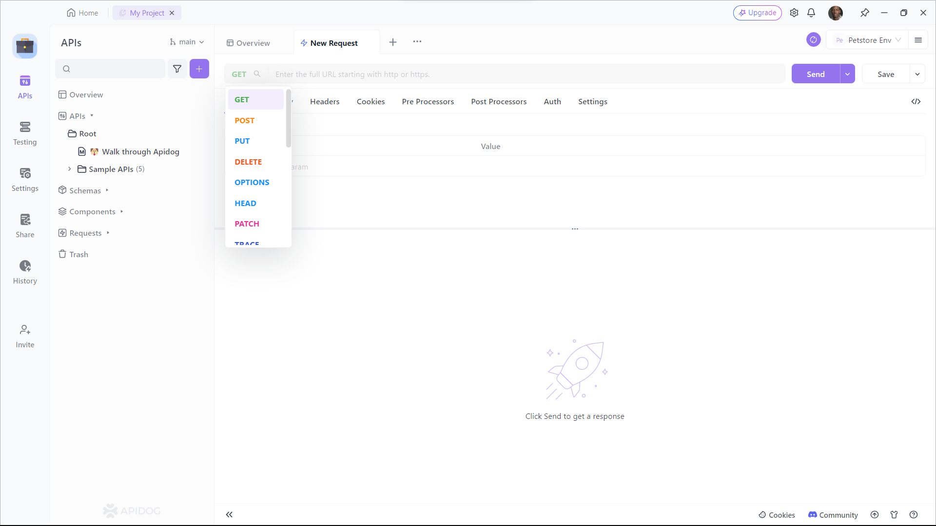
Step 1: Open Apidog and Create a Request
Step 2: Configure Your Request
- Enter the API endpoint URL.
- Select the HTTP method (GET, POST, etc.).
- Add headers, parameters, or body as needed.
Step 3: Send the Request and View Results
- Click the Send button.
- Instantly see status codes, response times, and body data.
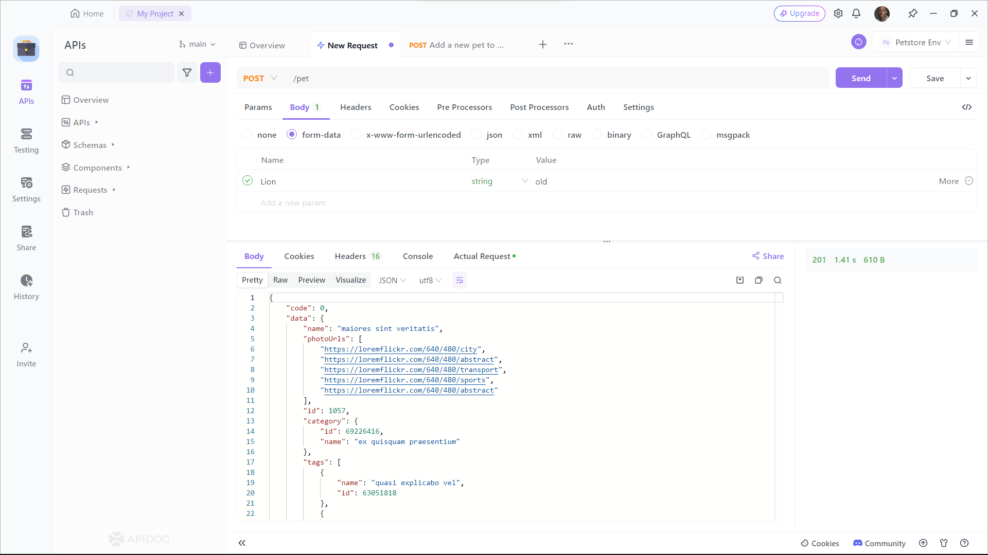
With Apidog, you can validate your APIs, debug issues, and even generate documentation—all from a user-friendly interface.
Best Practices for React UI & API Workflows
To maximize productivity and code quality:
- Import Only What You Use: Keep your bundle lean by only bringing in necessary Shadcn/UI components.
- Componentize Your UI: Build reusable, modular components instead of monolithic ones.
- Test APIs Early and Often: Use Apidog to verify endpoints before integrating them into your React codebase.
- Use Version Control: Commit code frequently and collaborate efficiently—especially on teams.
Conclusion
Shadcn/UI empowers React developers to build modern, lightweight, highly customizable interfaces—without the overhead of heavy frameworks. Pairing it with Apidog ensures your front-end and API workflows remain fast, reliable, and collaborative from start to finish.
Whether you’re building internal tools, admin dashboards, or customer-facing products, this combo delivers both flexibility and speed. For API teams and developers who care about high code quality and rapid iteration, Shadcn/UI and Apidog are a powerful match.
P.S. If you work with APIs, give Apidog a try—it can save hours in testing and debugging.


