
I spent an afternoon last month rebuilding a user dashboard. Fifteen repetitive React components, all with similar markup but different data shapes. Instead of copy-pasting, I fed rough sketches to OpenAI Codex and got production-ready code in minutes. The catch? You need more than just a loose prompt. This guide shows you how to wield Codex like a senior frontend engineer; precise prompts, smart workflows, and integration patterns that keep you in control.
What Is OpenAI Codex and Why Use It for UI Generation?
OpenAI Codex is a descendant of GPT models trained on billions of lines of public code. It translates natural language into working code across dozens of languages, but it truly shines for UI work: HTML, CSS, React, Vue, and even framework-specific component libraries. Unlike basic autocomplete, Codex understands layout intent. Tell it “a sticky navbar that collapses on scroll” and it spits out semantic HTML, accessible ARIA labels, and performance-minded CSS. You get more than boilerplate—you get patterns that follow modern best practices. For developers, this means:
- Faster prototyping: Sketch an idea, get markup in seconds
- Consistent patterns: Enforce design systems across teams
- Reduced context switching: Stay in your IDE, describe the UI, get code
- Learning accelerator: Reverse-engineer its output to understand new frameworks
The model runs via OpenAI’s API. You pay per token, so efficient prompts save money and time.
Setup: Accessing Codex for UI Work
Step 1: Get Your API Key
- Go to platform.openai.com -> api-keys
- Click Create new secret key
- Store it securely:
export OPENAI_API_KEY="sk-..."
Step 2: Install the Codex CLI
# Option A: OpenAI Codex CLI
npm install -g @openai/codex

# Option B: Using the SDK
npm install openai
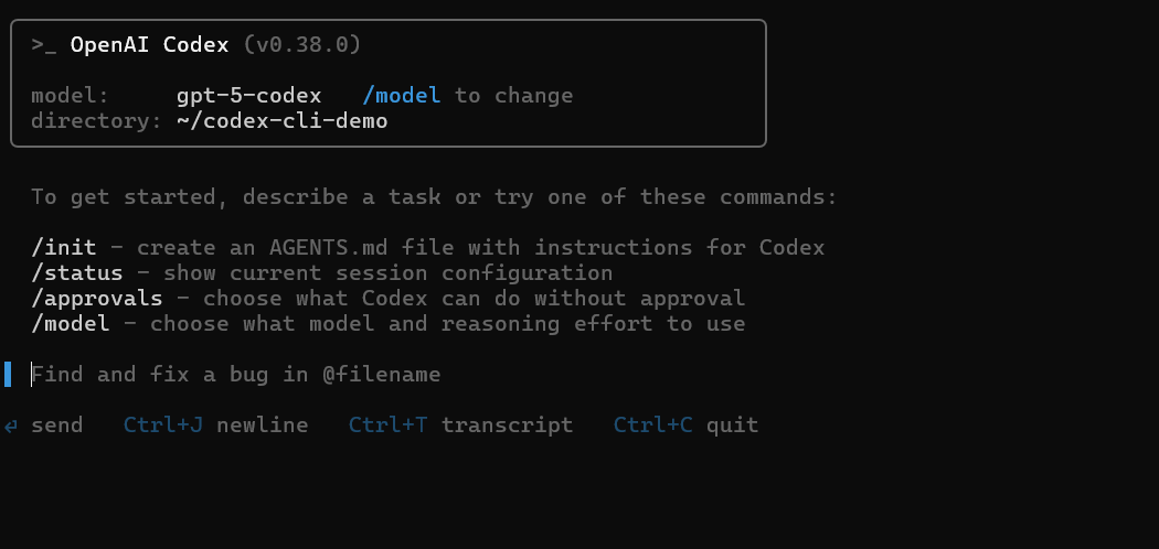
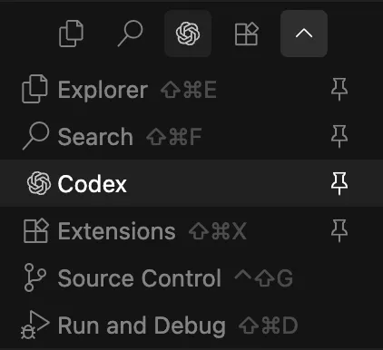
Or you can use Codex in VS Code via VS Code extensions.
Step 3: Test Your Setup
curl https://api.openai.com/v1/completions \
  -H "Content-Type: application/json" \
  -H "Authorization: Bearer $OPENAI_API_KEY" \
  -d '{
    "model": "code-davinci-002",
    "prompt": "/* Create a responsive card with flexbox */",
    "max_tokens": 150,
    "temperature": 0.2
  }'
Expected response: A CSS snippet using display: flex, flex-wrap, and media queries. If you get an error, check your key permissions.
Step 4: Configure for UI Generation
Create a wrapper script for consistent parameters:
// codex-ui.js
const { Configuration, OpenAIApi } = require("openai");

const configuration = new Configuration({
  apiKey: process.env.OPENAI_API_KEY,
});
const openai = new OpenAIApi(configuration);

async function generateUI(prompt, language = "html") {
  const response = await openai.createCompletion({
    model: "code-davinci-002",
    prompt: `/* Generate ${language}: ${prompt} */`,
    max_tokens: 300,
    temperature: 0.2, // Low for deterministic code
    stop: ["/*", "*/"],
  });
  return response.data.choices[0].text;
}

module.exports = { generateUI };
This wrapper enforces low temperature (less randomness) and stops at comment boundaries.
Core Prompt Engineering Patterns for UI Code
Garbage in, garbage out. The secret to great Codex output is structured prompts.

Pattern 1: Atomic Component Descriptions
Bad: "Make a button"
Good: "A primary button with 16px padding, blue background #3B82F6, white text, rounded corners 8px, hover state darkens to #2563EB, uses semantic <button>
// Input prompt
/* Generate HTML/CSS: A primary button with 16px padding, blue background #3B82F6,
   white text, rounded corners 8px, hover state darkens to #2563EB, disabled opacity 0.5 */

// Codex output
<button class="btn-primary" disabled>Submit</button>

<style>
.btn-primary {
  padding: 16px;
  background-color: #3B82F6;
  color: white;
  border-radius: 8px;
  border: none;
  cursor: pointer;
}
.btn-primary:hover:not(:disabled) {
  background-color: #2563EB;
}
.btn-primary:disabled {
  opacity: 0.5;
  cursor: not-allowed;
}
</style>
Pattern 2: Layout Intent with Constraints
Bad: "Make a layout"
Good: "A 3-column grid layout for desktop, collapses to single column on mobile, gap 24px, max-width 1200px, centered with auto margins, using CSS Grid"
/* Input prompt */
/* Generate CSS: 3-column grid, desktop only, 24px gap, max-width 1200px,
   mobile single column, centered */

/* Codex output */
.grid-container {
  display: grid;
  grid-template-columns: repeat(3, 1fr);
  gap: 24px;
  max-width: 1200px;
  margin: 0 auto;
  padding: 0 16px;
}

@media (max-width: 768px) {
  .grid-container {
    grid-template-columns: 1fr;
  }
}
Pattern 3: Framework-Specific Syntax
Tell Codex which framework and version:
// React 18, TypeScript, Tailwind CSS
/* Generate React component: A login form with email and password fields,
   uses useState hook, includes client-side validation for email format,
   submit button disabled until valid, Tailwind classes */

// Codex output
import React, { useState } from 'react';

export default function LoginForm() {
  const [email, setEmail] = useState('');
  const [password, setPassword] = useState('');

  const isValidEmail = /^[^\s@]+@[^\s@]+\.[^\s@]+$/.test(email);
  const isValidForm = isValidEmail && password.length >= 8;

  return (
    <form className="space-y-4 max-w-md mx-auto">
      <input
        type="email"
        value={email}
        onChange={e => setEmail(e.target.value)}
        className="w-full p-2 border rounded"
        placeholder="Email"
      />
      <input
        type="password"
        value={password}
        onChange={e => setPassword(e.target.value)}
        className="w-full p-2 border rounded"
        placeholder="Password"
      />
      <button
        type="submit"
        disabled={!isValidForm}
        className="w-full bg-blue-500 text-white p-2 rounded disabled:opacity-50"
      >
        Log In
      </button>
    </form>
  );
}
Practical Examples: Generating Real UI Components
Example 1: Responsive Dashboard Card
Prompt: "Generate HTML and Tailwind CSS for a dashboard card showing user stats: avatar, name, email, and three metrics (projects, tasks, teams). Use semantic HTML, ARIA labels, and a hover shadow effect."
# Using our wrapper script
node -e "require('./codex-ui').generateUI('Dashboard card with avatar, name, email, three metrics', 'html').then(console.log)"
Output (cleaned):
<article class="stat-card" aria-label="User stats for Alex Doe">
  <img src="avatar.jpg" alt="Alex Doe" class="avatar">
  <h3>Alex Doe</h3>
  <p>alex@example.com</p>
  <div class="metrics">
    <div>Projects <span>12</span></div>
    <div>Tasks <span>48</span></div>
    <div>Teams <span>3</span></div>
  </div>
</article>

<style>
.stat-card {
  @apply bg-white p-4 rounded-lg shadow-md hover:shadow-lg transition-shadow;
}
.avatar {
  @apply w-16 h-16 rounded-full mx-auto mb-2;
}
.metrics {
  @apply grid grid-cols-3 gap-2 mt-4 text-center;
}
</style>
Example 2: CSS Grid Photo Gallery
Prompt: "CSS Grid for a photo gallery: 4 columns on desktop, 2 on tablet, 1 on mobile, gap 16px, images maintain aspect ratio, use object-fit: cover."
/* Input */
/* Generate CSS Grid: 4 columns desktop, 2 tablet, 1 mobile, 16px gap,
   maintain aspect ratio, object-fit cover */

/* Output */
.photo-grid {
  display: grid;
  grid-template-columns: repeat(4, 1fr);
  gap: 16px;
}

.photo-grid img {
  width: 100%;
  height: 250px;
  object-fit: cover;
}

@media (max-width: 1024px) {
  .photo-grid {
    grid-template-columns: repeat(2, 1fr);
  }
}

@media (max-width: 640px) {
  .photo-grid {
    grid-template-columns: 1fr;
  }
}
Example 3: Accessible Navigation Menu
Prompt: "Generate semantic HTML for a dropdown navigation menu with keyboard navigation: arrow keys, Escape to close, aria-expanded attribute, uses <ul><li>
<nav aria-label="Main navigation">
  <ul class="nav-menu">
    <li>
      <a href="/">Home</a>
    </li>
    <li class="has-dropdown">
      <button aria-expanded="false" aria-haspopup="true">Services</button>
      <ul class="dropdown">
        <li><a href="/web">Web Dev</a></li>
        <li><a href="/mobile">Mobile</a></li>
      </ul>
    </li>
  </ul>
</nav>

<script>
// Keyboard navigation logic
document.querySelectorAll('.has-dropdown button').forEach(button => {
  button.addEventListener('keydown', e => {
    if (e.key === 'Escape') {
      button.setAttribute('aria-expanded', 'false');
    }
  });
});
</script>
Advanced Codex Workflows: Scaling UI Generation
Batch Generation for Design Systems
Create a JSON manifest of components, then loop Codex calls:
// components.json
[
  {
    "name": "Button",
    "prompt": "Button component, primary, secondary, disabled variants, 8px radius, Tailwind"
  },
  {
    "name": "Modal",
    "prompt": "Modal dialog with backdrop click to close, focus trap, aria-modal=true"
  }
]

// batch-generate.js
const fs = require('fs');
const { generateUI } = require('./codex-ui');

const components = JSON.parse(fs.readFileSync('components.json', 'utf8'));

components.forEach(async ({ name, prompt }) => {
  const code = await generateUI(prompt, 'html');
  fs.writeFileSync(`./output/${name}.html`, code);
});
Refining Output with Follow-Up Prompts
Codex sometimes misses nuance. Chain prompts to iterate:
# Initial prompt
"Generate a pricing table with 3 tiers"

# Follow-up (if output lacks responsiveness)
"Make the previous pricing table stack vertically on screens below 640px"

# Follow-up (add badges)
"Add 'Most Popular' badge to middle tier, absolutely positioned top-right"
This is cheaper than one mega-prompt and gives you editorial control.
Integrating with Build Tools
Hook Codex into your dev server:
// vite.config.js
import { generateUI } from './codex-ui';

export default {
  plugins: [{
    name: 'codex-ui-generator',
    configureServer(server) {
      server.middlewares.use('/__codex', async (req, res) => {
        const { prompt } = req.query;
        const code = await generateUI(prompt, 'html');
        res.setHeader('Content-Type', 'text/plain');
        res.end(code);
      });
    }
  }]
};

// In browser: fetch('/__codex?prompt=generate%20login%20form').then(r => r.text())
Common Pitfalls & Best Practices when Using Codex
Pitfall 1: Overly Vague Prompts
Fix: Always specify layout method (Flexbox, Grid), breakpoint values, and accessibility requirements. Use the "Atomic" pattern.
Pitfall 2: Ignoring Token Limits
Fix: Codex maxes out at 4,000 tokens (prompt + output). For large components, split by section: generate layout first, then inner content.
Pitfall 3: Blindly Trusting Output
Fix: Always run generated code through linters:
# HTML validation
npx html-validate generated.html

# CSS linting
npx stylelint generated.css
Also test your generated code in a browser, check responsiveness (e.g., resize window) and use dev tools to inspect elements.
Best Practice: Version Control Generated Code
Track .codex-prompts files alongside generated code. When you need to regenerate, you have the original prompt:
# .codex-prompts/button.prompt
/* Generate HTML/CSS: Primary button, 16px padding, #3B82F6, hover #2563EB */
Test Your Codex-Generated UI APIs with Apidog
Codex builds the frontend, but your UI is only as good as the API it consumes. When you generate forms that hit REST endpoints, validate those contracts with Apidog. Import your backend’s OpenAPI spec, generate test cases for each endpoint, and run them against your dev server.
Codex might build a beautiful login form, but Apidog confirms the /auth endpoint actually accepts the payload. It’s free to start, and it bridges the gap between AI-generated UI and reliable backend integration.
Frequently Asked Questions
Q1. Can Codex generate production-ready CSS?
Yes, if your prompts are specific. Always add accessibility attributes, responsive breakpoints, and performance hints. Treat its output as a first draft—lint and refine before shipping.
Q2. How do I handle framework-specific syntax?
Prefix your prompt with the framework and version: "React 18, TypeScript, Next.js pages router". Codex knows framework idioms.
Q3. Is there a cost difference between HTML vs React generation?
Token usage is similar. React output costs slightly more due to import statements and hooks. Monitor usage with OpenAI’s dashboard.
Q4. What’s the best temperature setting for UI code?
0.2 is the sweet spot. Lower values repeat training data; higher values get creative but stray off-task. For repetitive tasks (e.g., generating 20 similar cards), drop to 0.1.
Q5. Can I generate entire page layouts in one prompt?
Only for simple pages. Complex layouts exceed token limits. Break it down: generate header → sidebar → main content → footer, then compose.
Conclusion
OpenAI Codex transforms UI development from manual typing to guided generation. The key is prompt engineering: be atomic, specify constraints, and iterate. Start with small components, build a library of trusted prompts, and integrate Codex into your build pipeline. You’ll ship faster and maintain consistency across projects. And when those UIs talk to APIs, validate the entire stack with Apidog. The future of frontend work isn’t just AI-assisted—it’s AI-orchestrated.


