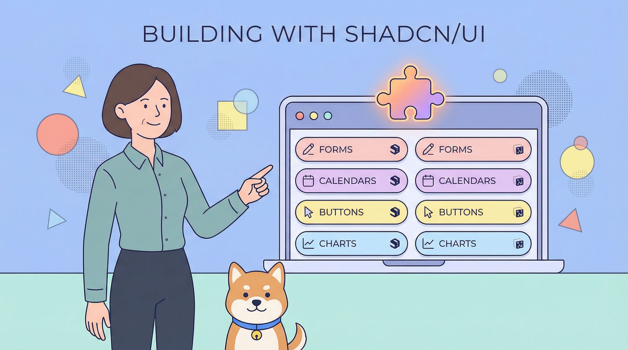
Modern React development often comes down to two competing demands: ship high-quality user interfaces quickly, and keep the codebase maintainable and accessible. shadcn/ui—the open-source component collection that pairs Radix UI primitives with Tailwind CSS—meets both demands out of the box. But the community has gone a step further, building entire libraries and niche add-ons that extend shadcn/ui into calendars, e-commerce blocks, form builders, and more.
Below you’ll find a carefully curated list of ten standout projects. Each was selected for its code quality, design polish, active maintenance, and the clear value it adds on top of the core shadcn/ui set. Whether you’re prototyping an MVP or fleshing out a production dashboard, these resources will help you move faster without compromising consistency.
1. Auto-Form
Auto-Form is a React component that inspects a Zod schema and produces a ready-to-use form composed of shadcn/ui inputs, selects, switches, and validation messages. You write a single schema that defines field names, types, default values, and validation rules; Auto-Form translates that schema into a fully wired form with controlled components and error handling.
Why it matters
Manually wiring forms is repetitive and brittle. Auto-Form removes boilerplate, keeps form state and validation in sync, and guarantees the UI matches the underlying schema. Because Zod is also a TypeScript-first library, you get type safety end-to-end: from the schema definition to the props on each generated component.
Ideal use cases
- Admin settings pages where fields change frequently
- Dynamic internal tools whose forms are driven by database schemas
- Rapid prototypes that still require strong validation
Project link → https://github.com/vantezzen/auto-form
2. Big Calendar

Big Calendar is a modern, full-featured calendar application written with Next.js, TypeScript, Tailwind CSS, and shadcn/ui. It ships with month, week, day, and agenda views, drag-and-drop support, recurring events, and theming consistent with the rest of the shadcn/ui ecosystem.
Why it matters
Calendars are deceptively hard to build from scratch—time-zone quirks, date math, accessibility, and performance all come into play. Big Calendar handles those edge cases for you while maintaining a clean, composable component structure that developers can extend.
Ideal use cases
- SaaS dashboards that visualize meetings, tasks, or bookings
- Healthcare or fitness apps with appointment scheduling
- Internal resource-planning tools
Project link → https://github.com/lramos33/big-calendar
3. Calendar
Simply named Calendar, this project is a Google-Calendar-style interface that leans on shadcn/ui components for layout and interaction. It offers month and agenda views, keyboard navigation, and color-coded events, with an intentionally small dependency footprint.
Why it matters
If Big Calendar feels too feature-heavy, Calendar gives you a lean starting point. Its API exposes hooks for data fetching and event rendering, so you can swap in your own back-end or extend the UI with minimal friction.
Ideal use cases
- Personal productivity tools
- Event timelines inside larger dashboards
- MVPs that may later graduate to a more complex calendar system
Project link → https://github.com/charlietlamb/calendar
4. Capture-Photo

Capture-Photo is a browser-based React component that enables camera functionality—opening a device’s webcam, displaying the live feed, and capturing still images. It wraps the Media Devices API but uses shadcn/ui buttons, dialogs, and badges for consistent styling.
Why it matters
Integrating native camera access in the browser often means juggling permissions, cross-browser quirks, and ad-hoc styling. Capture-Photo abstracts those hurdles, leaving you to focus on storing or processing the captured image.
Ideal use cases
- On-boarding flows that collect user avatars
- Field-data collection apps for inspections or inventory
- Identity verification that requires real-time photo capture
Project link → https://github.com/UretzkyZvi/capture-photo
5. Commerce UI

Commerce UI provides a growing library of storefront blocks—hero sections, product grids, carts, checkouts, and account dashboards—built entirely with shadcn/ui, Tailwind, and Headless UI interactions. Each block comes with responsive variants and accessibility baked in.
Why it matters
E-commerce UI has unique requirements: persuasive design, quick visual feedback, and highly optimized layouts. Commerce UI tackles those while adhering to the shadcn/ui style rules, so you can mix storefront pages with custom dashboards without a jarring shift in look and feel.
Ideal use cases
- DTC brands launching quickly on Next.js
- Multi-tenant marketplace platforms that need consistent store themes
- Prototypes for investor demos
Project link → https://github.com/stackzero-labs/ui
6. Date-Time Range Picker shadcn

This component delivers an enterprise-grade date-time range picker: multi-month and multi-year navigation, predefined quick-select ranges, optional time-zone handling, and keyboard accessibility. Under the hood it uses Radix UI Popovers and shadcn/ui inputs while abstracting complex date logic with date-fns.
Why it matters
Date picking becomes exponentially harder once time zones, start/end boundaries, and accessibility are required. The component solves these issues in a modular fashion—subcomponents like Calendar Grid, Time Select, and Preset List can be used alone or composed together.
Ideal use cases
- Analytics dashboards that filter data by custom ranges
- Travel or booking apps with global users
- Finance applications requiring precise timestamps
Live demo link → https://date-time-range-picker.vercel.app/
7. eo-n/ui

eo-n/ui is an opinionated component library that extends shadcn/ui with elements from Base UI and a bespoke Tailwind design system. It offers headless primitives as well as fully styled widgets—cards, timelines, icon buttons, and animated tabs—all themeable through CSS variables.
Why it matters
While shadcn/ui deliberately ships unstyled components, many teams prefer starting with visually distinctive defaults. eo-n/ui bridges the gap: you get pre-styled variants while retaining Tailwind utility control for overrides.
Ideal use cases
- Enterprise apps seeking a unique design language without reinventing every component
- Teams that want to mix shadcn/ui ergonomics with Base UI patterns
- Projects that need dark-mode toggles and theme switching out of the box
Project link → https://github.com/aeonzz/eo-n
8. Hexta UI

Hexta UI is a collection of landing-page blocks and interface widgets optimized for marketing sites. Beyond typical cards and navbars, it includes call-to-action strips, pricing tables, FAQ accordions, and testimonial sliders—all following shadcn/ui accessibility guidelines.
Why it matters
Product teams often reach for design SaaS templates to scaffold a marketing site, then later struggle to integrate them with the app’s component library. Hexta UI avoids that disconnect by sharing styling tokens and motion patterns with shadcn/ui, ensuring seamless visual continuity between marketing pages and the application itself.
Ideal use cases
- Launch pages for new SaaS products
- Documentation sites that require marketing sections
- Portfolio pages built with Next.js and Tailwind
Website link → https://hextaui.com/
9. UI-X by Junwen K
UI-X is a curated gallery of accessible, copy-and-paste components: feature sections, stats counters, pagination, progress bars, and more. Each snippet is presented with light and dark variants, ARIA roles, and TypeScript props where relevant.
Why it matters
Sometimes you only need a single component, not an entire library dependency. UI-X focuses on isolated snippets you can slot into an existing codebase, saving you the weight of an npm install while keeping design language cohesive.
Ideal use cases
- Filling gaps in an otherwise complete design system
- Hackathon projects where speed outranks deep customization
- Educational purposes—each snippet is small enough to read and learn from
Gallery link → https://ui-x.junwen-k.dev/
10. MVP Blocks

MVP Blocks aggregates responsive, animated sections—hero headers, content grids, footers, and modal workflows—that you can literally copy and paste. Motion is handled via Framer Motion, styling with Tailwind, and structural components with shadcn/ui.
Why it matters
When speed to market is everything, having production-ready blocks you can rearrange like LEGO bricks is invaluable. MVP Blocks emphasizes developer ergonomics: minimal dependencies, explicit props, clear Tailwind classes, and easily swappable assets.
Ideal use cases
- Rapid MVP launches
- A/B testing new page layouts
- Startups iterating on landing pages before full design investment
Project link → https://blocks.mvp-subha.me/
Conclusion
shadcn/ui has unlocked a new layer of productivity for React and Next.js developers: ergonomic APIs, Radix-level accessibility, and first-class Tailwind support. The components and libraries above extend that foundation into forms, calendars, marketing pages, and complex data inputs—areas traditionally riddled with edge cases.
Choosing which resource fits your project ultimately depends on scope:
- Need dynamic, type-safe forms? Start with Auto-Form.
- Building a scheduling-heavy SaaS? Big Calendar or Calendar will cover most requirements.
- Launching a storefront quickly? Commerce UI gives you conversion-focused blocks that drop into any Tailwind layout.
- Filtering data across time zones? The Date-Time Range Picker handles the heavy lifting.
- Racing to demo an MVP? MVP Blocks and Hexta UI provide pre-animated sections ready to ship.
Because each project embraces open-source licenses, you remain free to fork, customise, and contribute back. Explore the repositories, read the source, and adapt the pieces you need—the true strength of shadcn/ui lies in how effortlessly it lets you compose and extend modern, accessible interfaces.
With these ten libraries at your disposal, you can focus less on rebuilding common UI patterns and more on solving the unique challenges of your product. Happy building!